Chryssa & Jenny Holzer
February 27 – April 27, 2024
Underlying Modularity
Written by Max Lust and Ekin Erkan
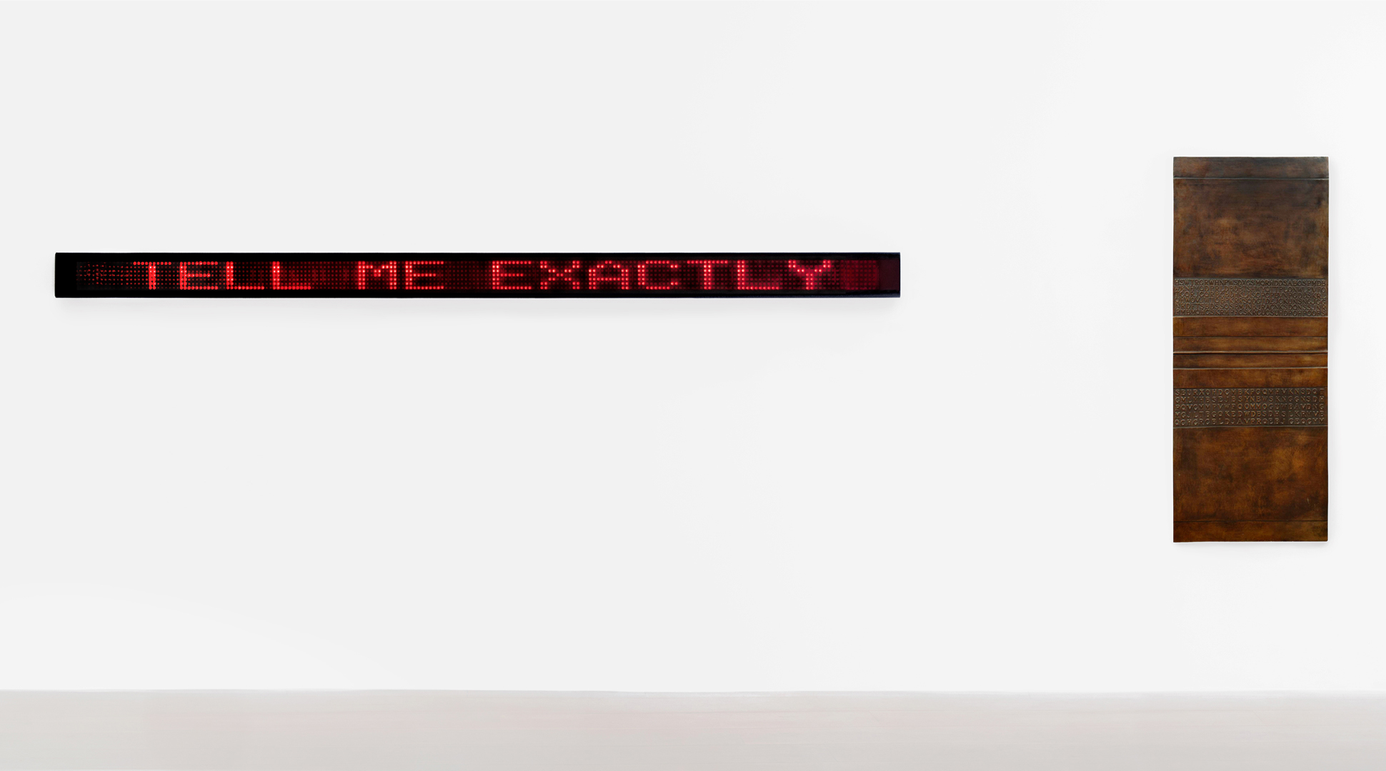
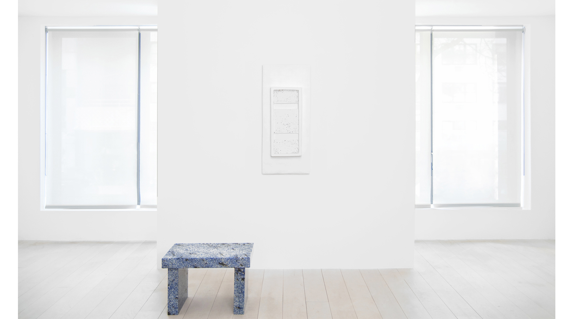
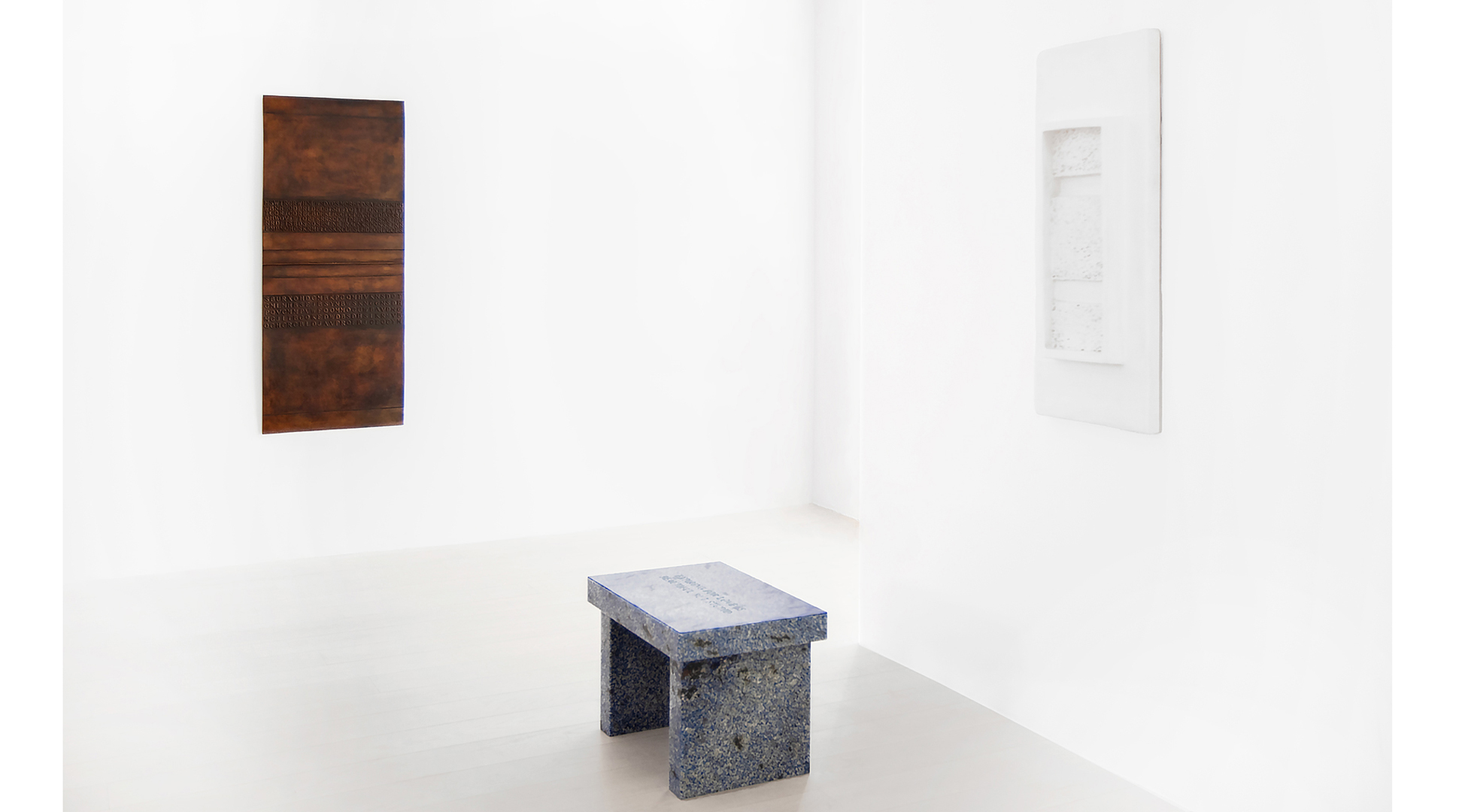
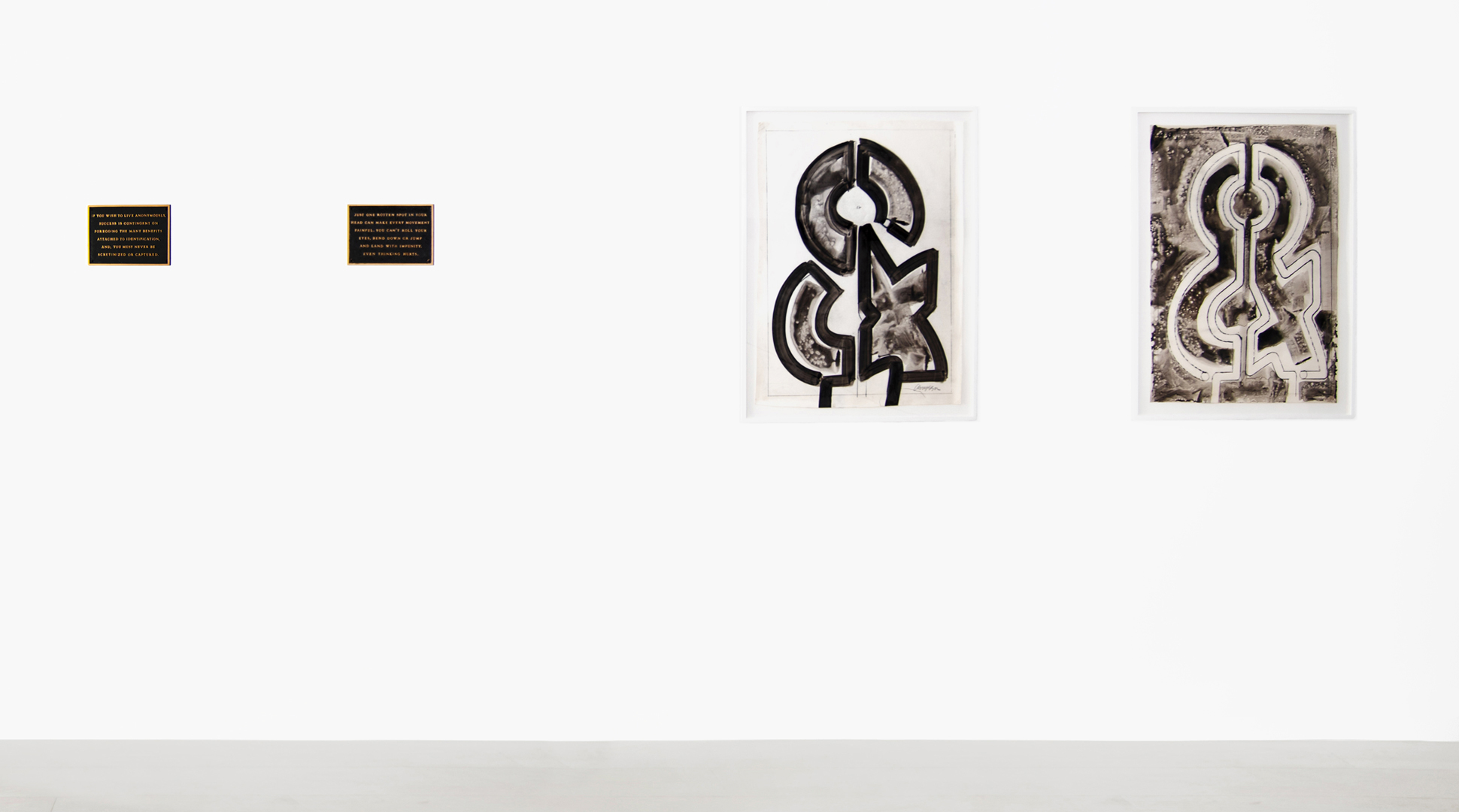
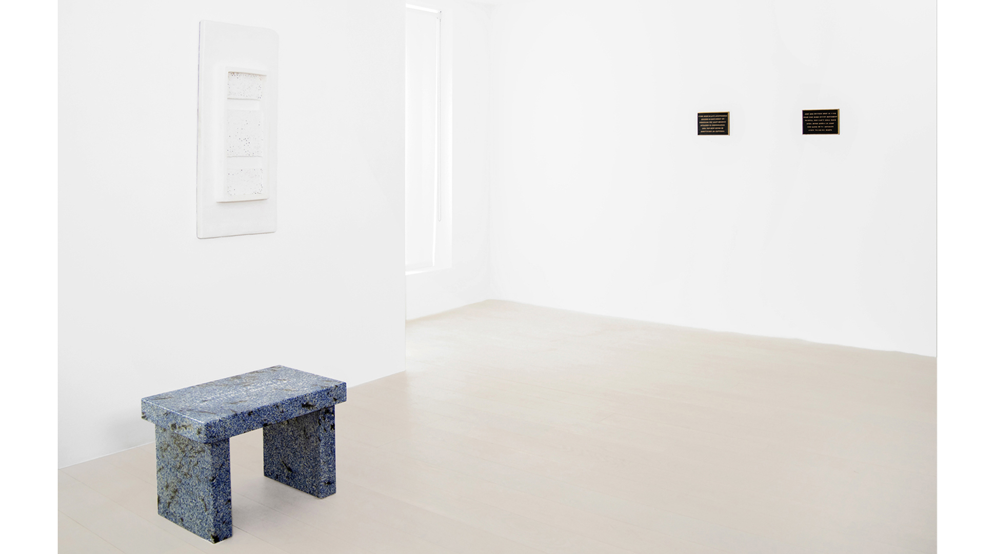
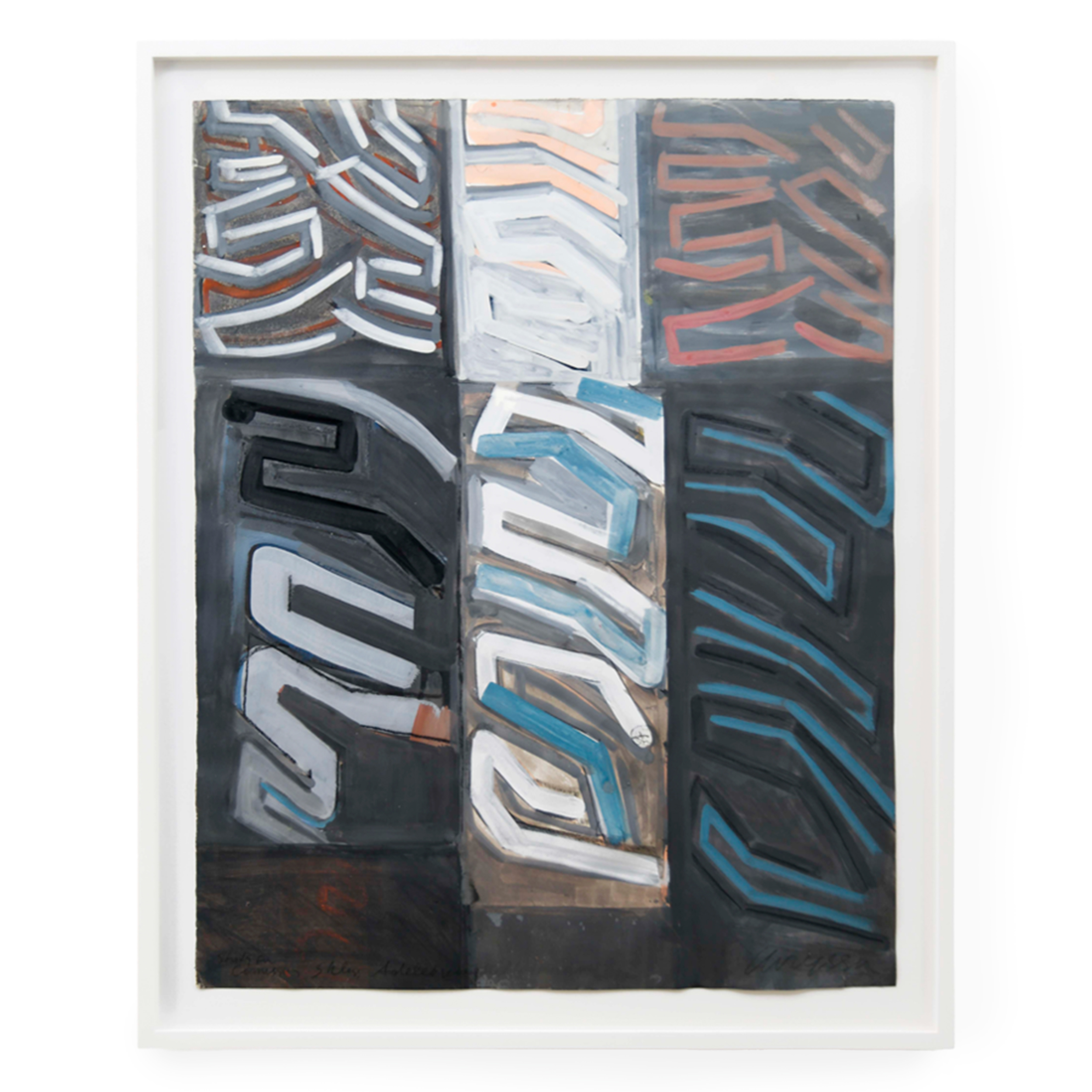
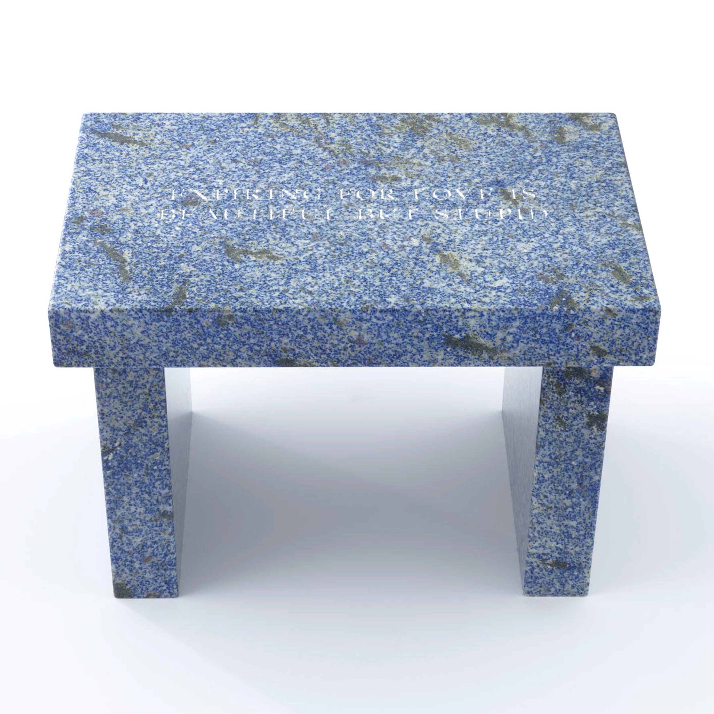
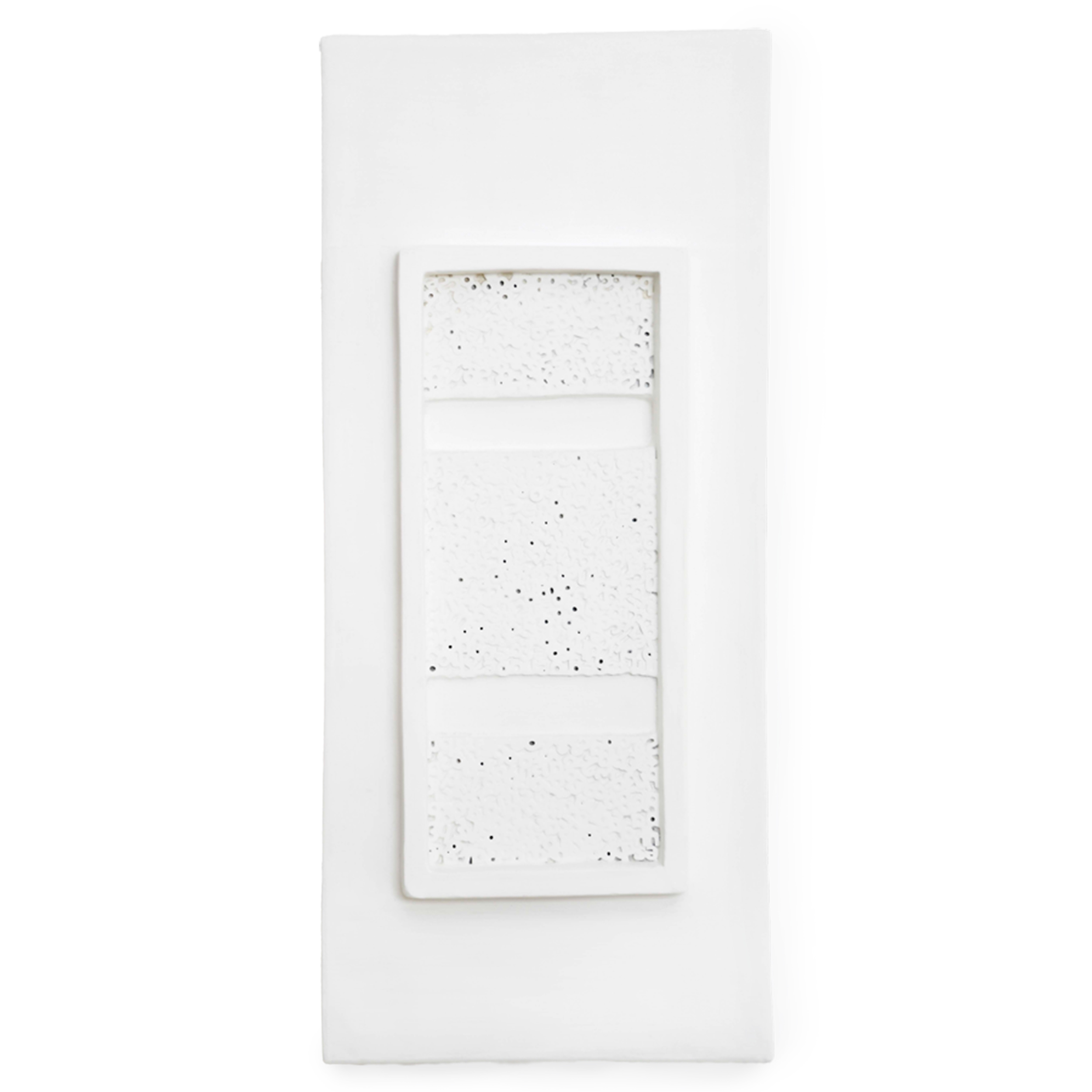
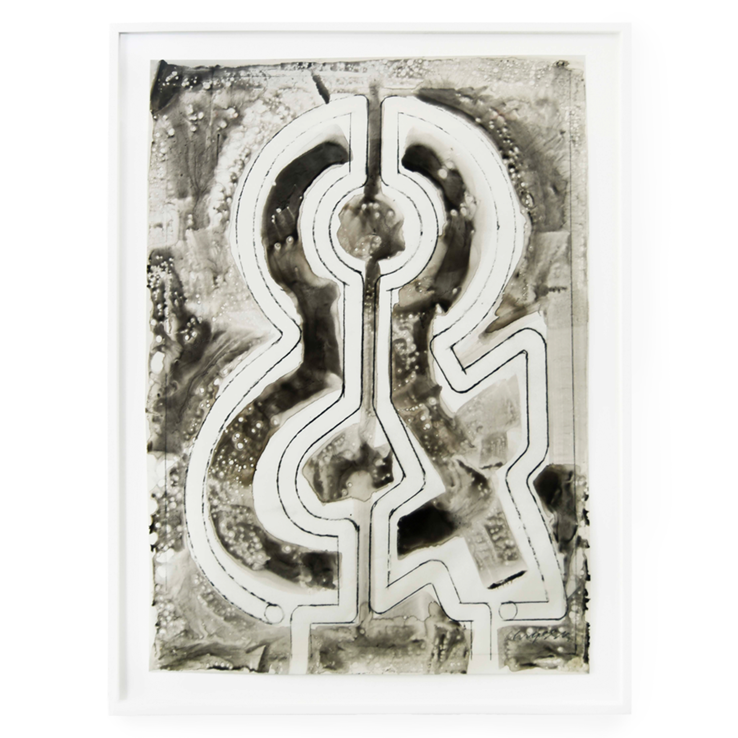
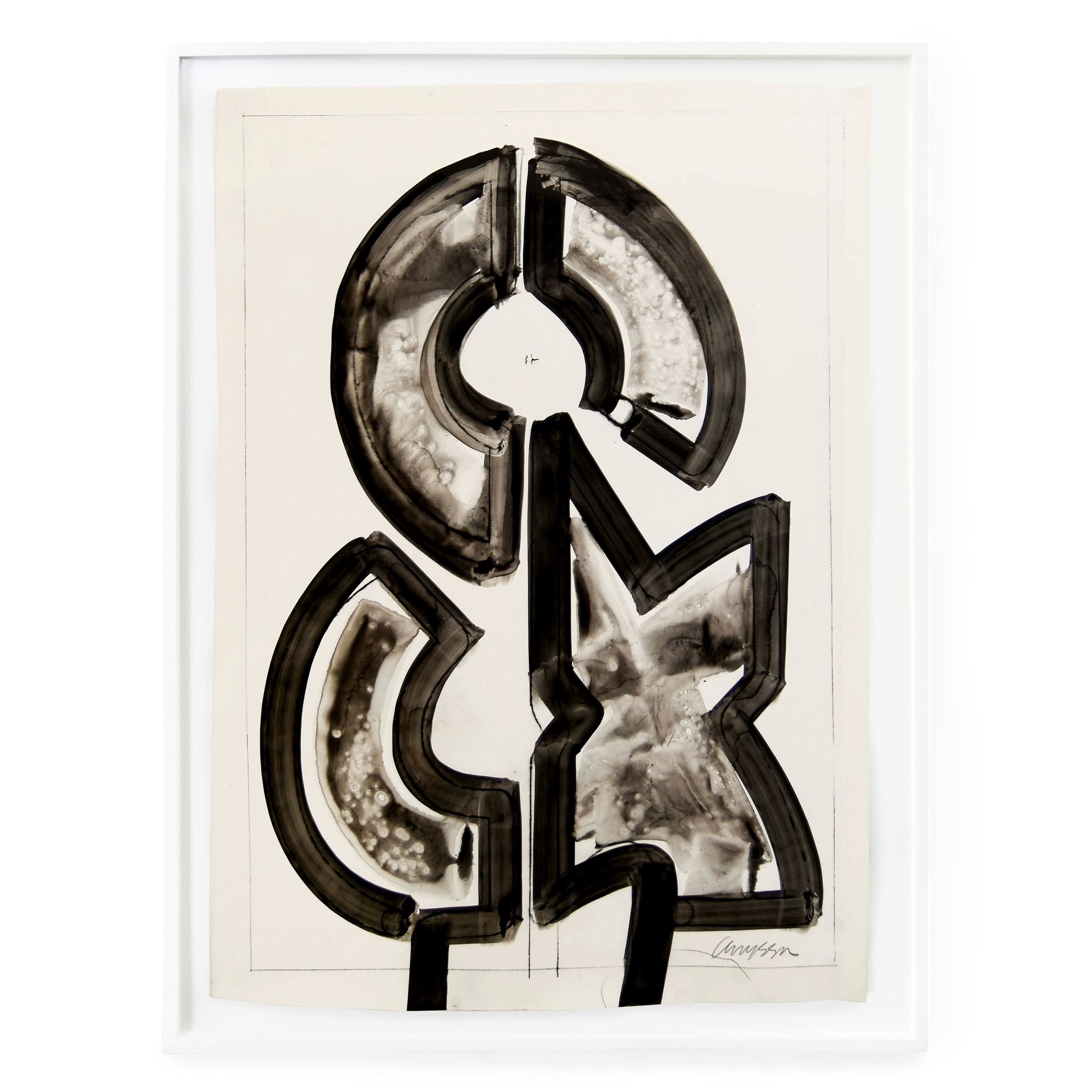
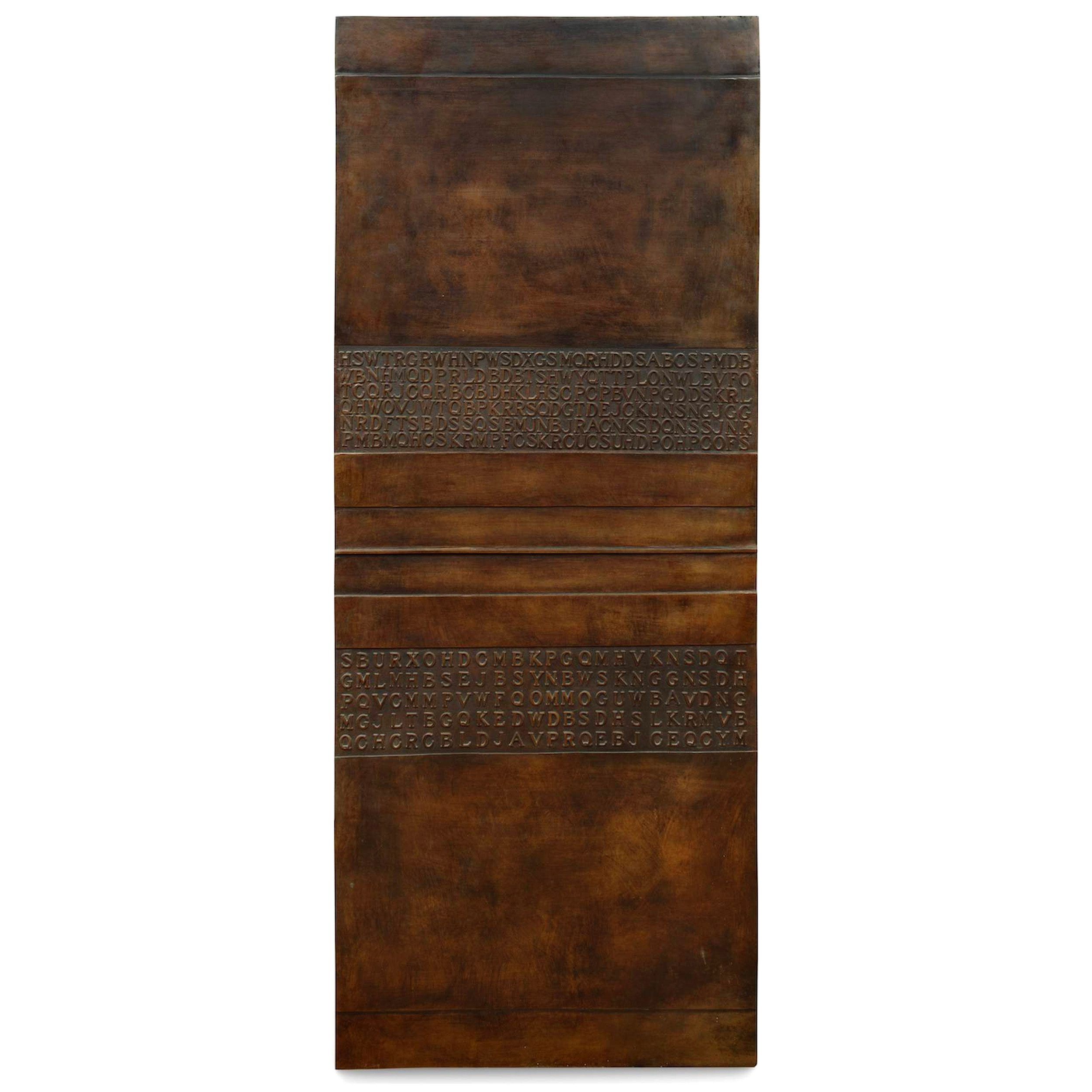
New York, NY – Mignoni Gallery is proud to present “Underlying Modularity”, an exhibition juxtaposing two female text-based artists— Chryssa and Jenny Holzer—whose work uses language as a motif to analyze industrial and contemporary mass media. Although mass communication is fundamental for the artists, a notable point of departure is Chryssa’s experimentation with typography, which she instrumentalizes to engender abstracted meanings. While Holzer uses forms of mass media to communicate coherent (i.e., non-abstract) messages vis-à-vis sentences, Chyrssa’s work takes on a more elliptical form, exemplified by her two Ampersand works on paper and the grid-like format of the bronze tablet featured in the exhibition. Along with Holzer’s footstool, Selection from Truisms: Expiring for love…, 2015, also included in the exhibition, these pieces make use of letters within a comparable grid-like format. However, Holzer’s footstool legibly reads “Expiring for love is beautiful but stupid”. Although the sentence can be interpreted in several ways the various meanings are sententially contained. Chryssa’s bronze tablet, Homage to the Seagram building, however, is a non-objective work. The letters do not spell out any coherent words; much like her ampersands, Chryssa’s work averts semantically circumscribed meaning. Thus, while the piece does not employ abstract strokes or gestures, its meaning cannot be anchored in any object-oriented isomorphic homology. In turn, while the two artists utilize typographic elements, one artist veers towards objective meaning while the other’s abstractions elicit polysemy.
Given typography is the bridge between these two artists, it is worth further analyzing the machinations of this device. How, exactly, does typography function? Typography is a mereological ambit, with the parts of a letter eliciting the function of a greater whole, which ranges from words to sentences, paragraphs, and full-fledged narratives. The most elemental facets of a letter have their own notation. The “dot” of a lowercase “i” is known as a “title”; the cross of a “t” is the intersection of a vertical “stem” and a horizontal “bar”. These individual modular parts are known as typographic anatomy. Within this modular system, the difference between a lowercase “i” and “j” is the lower “tail” on the bottom of the “j”. This modular “tail” can also be found in a lowercase “y” and “g”. These are the very components Chryssa uses to create her typographic abstractions in her Neon series. Critically, Chryssa and Holzer explore typography in dichotomous directions (viz., the abstract vs. the objective). Writing, as a practice, relies upon modularity to function and it is this enterprise that Chryssa focuses on, analyzing the building blocks of typographic anatomy. Holzer’s domain is coarser-grained, looking towards the larger modular system and showing how, from an anatomy made up of “titles”, “stems”, “bars” and “tails”, we arrive at meanings—a whole greater than its parts. This interest in culturally-bequeathed meaning is befitting of an artist who emerged out of the postmodern along with artists working in the latter quarter of the 20th century who dealt with the associations of commercial images and advertising iconography by means of appropriation.
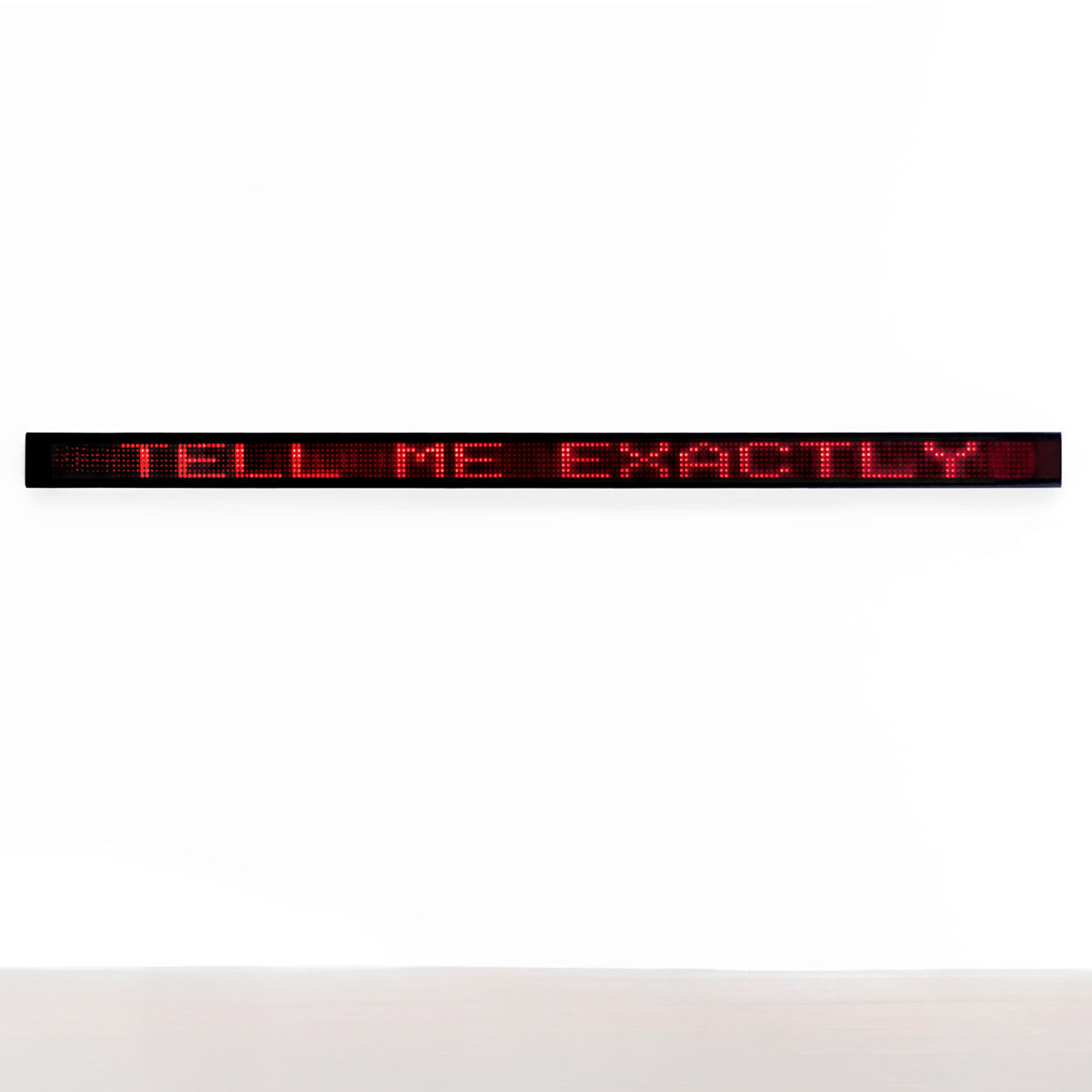
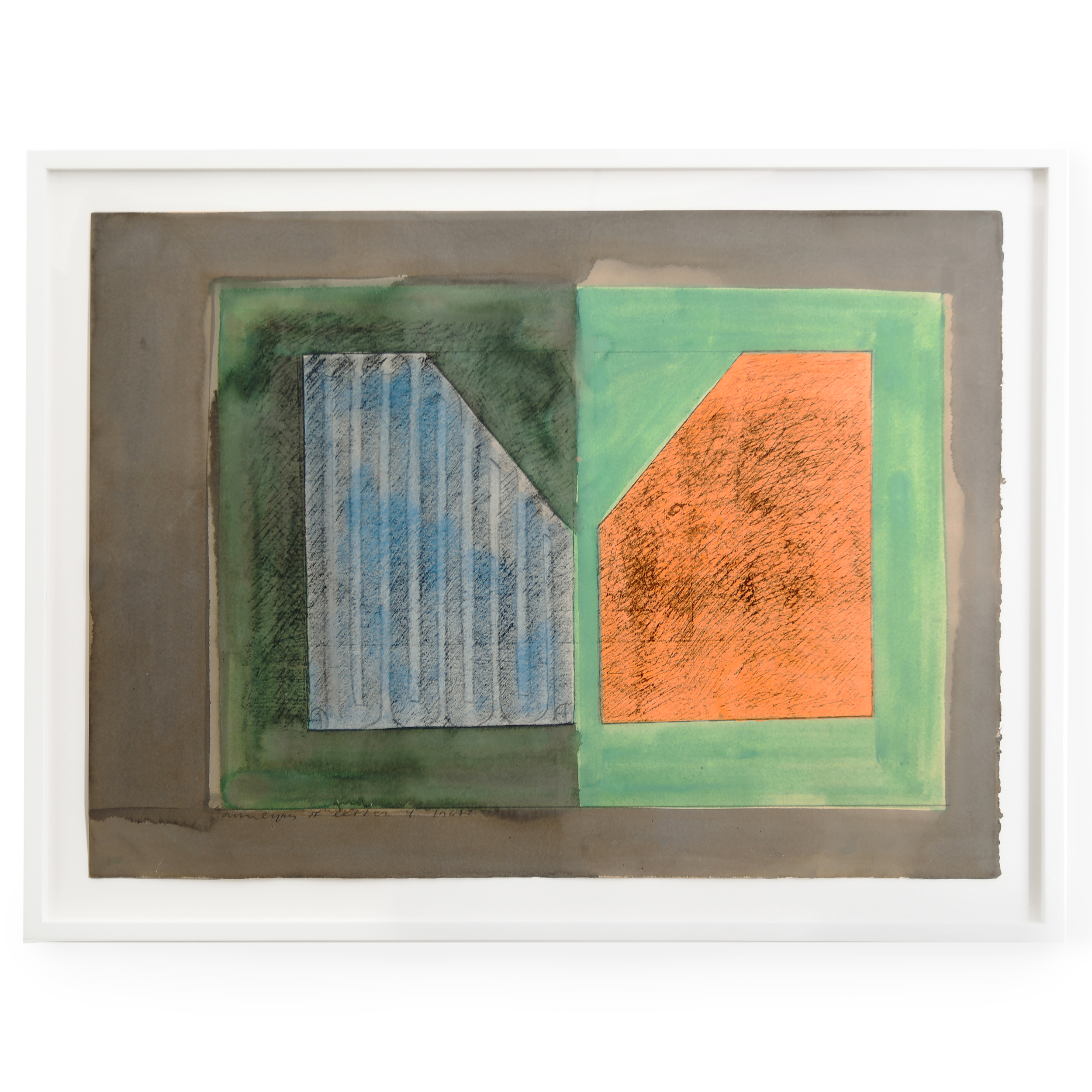
Another difference between the artists is Holzer’s signature use of “raster” text and Chryssa’s “stroke” text. This diversion transpires in the physicality of the two artists’ works: Holzer’s LED lights and Chryssa’s neons. Holzer’s selections from the Survival Series (1983-84) are based on a mosaic of LED bulbs that produce raster-based text. LED lights galvanize different colors as electricity travels through a microchip; the light is the byproduct of movement. Due to the static nature of her preferred lighting system, Holzer’s letters are a latticework of immobile, fixed entities. LED lights are physically fixed though they can give the optical illusion of animation through the flickering of the lights. It is through the grid format that the LED lights can morph and change. Chryssa and Holzer’s diverging material choices, in terms of their lighting systems, also foreground their different approaches to what is represented—and, consequently, to what is expressed, or meaning. Chryssa’s works on paper speak to the artist’s deep acuity for the science of neon. As preparatory studies, works like Analysis of Letter Y (1967) dismember neon into segments. Chryssa’s dynamic, fluid materials beget abstract letters (or symbols, as with her ampersands) endowed with abstract meanings whereas Holzer’s sentences and what they semantic express are fixed and static, though they allow for competing interpretations.
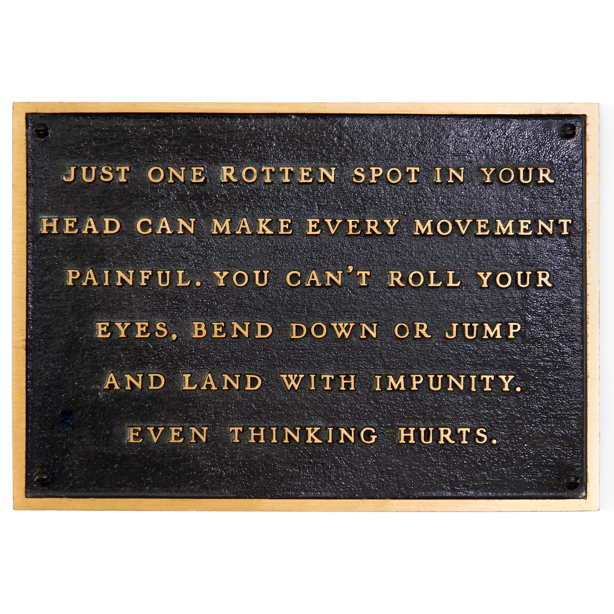
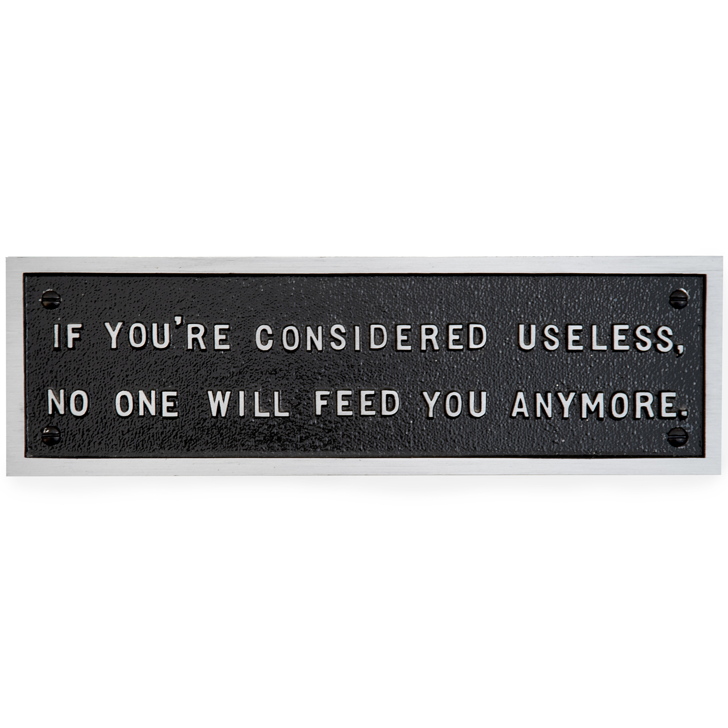
continue reading In Analysis of Letter Y, Chryssa drafts the anatomy of the letter with negative space in between two neon boxes. Here, Chryssa also creates a typographic abstraction with two neon boxes. The negative space forming the body of the “Y” is called “body width” and the negative space on the sides of the letter is called “character width”. As the “body with”, which normally represents the positive space of a letter, has been inverted, Chryssa has upended the letter’s traditional anatomy. The gap between the two boxes forms the body of the capital ‘Y’. In the lower half, we can see a vertical stem, and the upper half forms the letter’s two arms. On the left is a blue box and, inside, we can see a long glass stroke with a positive and a negative charge on opposite ends. The right orange box represents the outer metal case of the neon box. The blue stroke on the left demonstrates how the neon tube is meant to fit inside its outer encasement. That the left stroke is colored in blue suggests that it is to be filled with Xenon. The orange box on the right, suggests Neon gas. The sophisticated nature of Chryssa’s neon stroke is also evinced in the two ampersand variants, Ampersand Variant 1/5 (1965) and Ampersand Variant 3/5 (1965). In the respective drawings, Chryssa dissects the ampersand by halving and quartering it. The drawings allow for the ampersand to remain recognizable and will permit the travel of an electric current and the sealing of gas. These two ampersand studies use the same form as those in Chryssa’s fully realized neon Five variations on the Ampersand (1966), which are part of the MoMA collection. The inscription on one of Jenny Holzer’s plaques, featured in the exhibition, reads, “If you are considered useless, no one will feed you anymore.” Her utilization of text aims to scrutinize objective meaning, with a focus on cynical and political implications. The messages are often elliptical. Holzer’s work often confounds viewers’ expectations by presenting or inscribing blatantly contradictory nostrums or platitudes, drawing our attention to contradictory norms. Holzer’s phrases not only respond to the circuitous advertising displays riddling 20th-century commercial culture but also presage contemporary social media, which is rife with users proffering pithy and platitudinal epithets. Despite variations in media—be it ancient media (e.g., marble, bronze) or industrial media (e.g., neon and LED)—and meaning, Chryssa and Holzer’s work has become part of our cultural vernacular. The language that the artists appropriated and transmogrified has become so ubiquitous in advertising and art as to be easily neglected. The hope is that this exhibition will rectify this tendency, illuminating the sometimes-converging and sometimes-diverging thinking behind Chryssa and Holzer’s art practice while simultaneously analyzing their work from the perspective of science, topography, and graphic design.


